Animating SF Symbols on iOS 18
Published on: September 4, 2024Over the years, Apple has been putting tons of work into the SF Symbols catalog. With SF Symbols, we’re able to leverage built-in iconography that will look familiar to users while also fitting into the Apple ecosystem very nicely. The fact that there’s thousands of symbols to choose from makes it a highly flexible and powerful catalog of icons that, in my opinion, should be every designer and developer’s first choice when they’re looking for visual components to add to their apps.
Initially, SF Symbols were pretty much static. We could configure them with a color and thickness but that was about it. Now that we’re a few years down the line, Apple has added multiple ways to animate SF Symbols.
In this post, I’d like to take a look at the current state of SF Symbol animations and explore some of the available animation options and styles that are available to us today.
If you prefer to learn through video instead of text, check out this video on my YouTube channel
Basic SF Symbol animations
Overall, the ways in which we can animate SF Symbols are plenty. It’s honestly quite likely that this post end up missing some fun technique that you’ve discovered and enjoy using.
The reason for this is that I’ve found that it’s not immediately obvious just how powerful SF Symbol animations can be.
At the very core, it’s really not that complex to animate an SF Symbol. For example, we could quite easily create the animation below with just a few lines of code:

The code for creating an effect like that looks a bit like this:
Image(systemName: "airpodspro.chargingcase.wireless.radiowaves.left.and.right.fill")
    .symbolEffect(.wiggle, options: .repeat(.continuous))
What’s fun is that some symbols lend themselves to certain animations better than other. A wiggle is usually a fine way to draw attention to a symbol.
Notice how in the animation above you can distinguish between three layers that exist. The AirPods case, the inner “radio waves”, and the outer “radio waves”. SF Symbols lets us apply animations that change individual layers one by one. For example, to indicate a “searching” or “charging” animation you could want to have both radio waves be empty, then fill the inner ones, then the outer ones, and then have them be empty again.
A bit like this:

We can achieve that by changing the symbol effect that we’ve applied:
Image(systemName: "airpodspro.chargingcase.wireless.radiowaves.left.and.right.fill")
    .symbolEffect(.variableColor, options: .repeat(.continuous))
That’s pretty cool, right?
There’s a whole bunch of symbol effects available for you to try so I highly recommend to apply the symbolEffect view modifier to see which effects exist, and to see how they play with specific symbols. As you’ll see, some effects (like variableColor will work well with certain layered SF Symbols but not with others).
The variableColor effect is an effect that has a list of sub effects. In the example above, all layers get filled and then we reset back to a base state. This is equivalent to the following code:
Image(systemName: "airpodspro.chargingcase.wireless.radiowaves.left.and.right.fill")
    .symbolEffect(.variableColor.cumulative, options: .repeat(.continuous))
If you switch cumulative to iterative in the example above, the effect looks like this:

I highly recommend that you take a look at the available options and play with them to see how much you can really do with SF Symbol animations.
In the code above I used options to set my animation up to be repeating. You can choose to repeat continuously like I did, or you can repeat a set number of times.
It’s also possible to set the repeat behavior to be periodic. That way, your SF Symbol can show its animation once every couple of seconds as a nice way to draw the user’s attention towards the symbol without being obnoxious:

The code for this animation looks like this:
Image(systemName: "bell.circle")
    .symbolEffect(.wiggle, options: .repeat(.periodic(delay: 2)))
It’s pretty cool that we’re able to write animations this powerful with very little work. SF Symbols do a lot of the heavy lifting of building good looking animations for us.
It’s also possible to link a symbol effect to a specific value in your view so that the animation starts as soon as the linked value changes.
Here’s what the code to do that looks like:
Image(systemName: "bell.circle")
    .symbolEffect(.wiggle, options: .repeat(.periodic(2, delay: 2)), value: notificationsEnabled)

Button("Toggle Notifications") {
    notificationsEnabled.toggle()
}
Every time we click the button to change the value of notificationsEnabled we start our symbol effect which wiggles the bell twice before stopping our animation.
We can also link our effect to a boolean value that determines whether or not our effect is active at all:
Image(systemName: "bell.circle")
    .symbolEffect(.wiggle, options: .repeat(.periodic(delay: 2)), isActive: notificationsEnabled)
The code above is slightly different because it uses isActive instead of value to determine whether the animation is active. We’ve also gone back to a constantly repeating animation that will only be active whenever the notificationsEnabled property is true. As soon as it’s set to false, the animation will end.
It’s worth exploring which animations are available, and how you can mix and match different options and configurations in order to come up with some pretty cool animations.
Next, let’s take a look at symbol transitions.
SF Symbol Transitions
Sometimes, you might want to use an SF Symbol to represent a state-dependent piece of UI.
For example, you might present a notification bell to your user if they’ve enabled notifications but you might want to cross out the notification bell if the user turns off notifications.
The code to achieve that could look a bit like this:
Image(systemName: notificationsEnabled ? "bell" : "bell.slash")

Button("Toggle Notifications") {
    withAnimation {
        notificationsEnabled.toggle()
    }
}
When run, the result looks a bit as follows:

It’s not great and luckily, we can do better. SF Symbols can now nicely animate between different variants of the same symbols in most cases.
For example, SF Symbols can animate our bell example like this if we apply the right configuration:
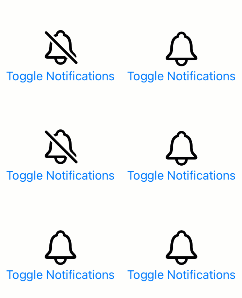
All that we need to do is provide a contentTransition for our symbol:
Image(systemName: notificationsEnabled ? "bell" : "bell.slash")
    .contentTransition(.symbolEffect(.replace))
Pretty cool, right? The .replace transition will always try to perform the most appropriate transition to move from one symbol to the next. In this case, that’s by seamlessly adding or removing our slash.
If we combine this with a different rendering mode, the effect looks even better:
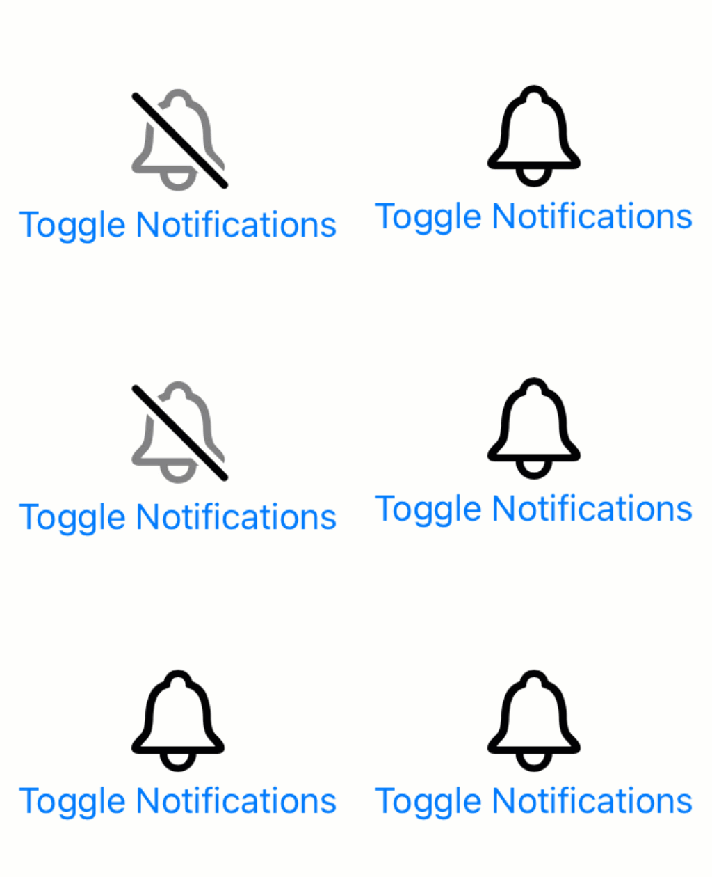
In the example above I’ve used a hierarchical rendering mode to automatically gain appropriate opacity levels for my symbol’s layers.
Image(systemName: notificationsEnabled ? "bell" : "bell.slash")
    .symbolRenderingMode(.hierarchical)
    .contentTransition(.symbolEffect(.replace))
Again, I encourage you to play around with different settings and options to see what you can come up with.
SF Symbols are a very powerful tool in your iOS development toolbox and I highly recommend that you spend some time exploring different options the next time you’re working on a design for your app’s UI. Adding the right animations at the right times can really make your app stand out in a good way.

)
