Using multi-colored icons in iOS 14 with SF Symbols 2

Apple introduced SF Symbols in iOS 13. SF Symbols allow developers to easily integrate icons in their apps. The SF Symbols icons integrate really well with the default system font, and provide a consistent look throughout the system.

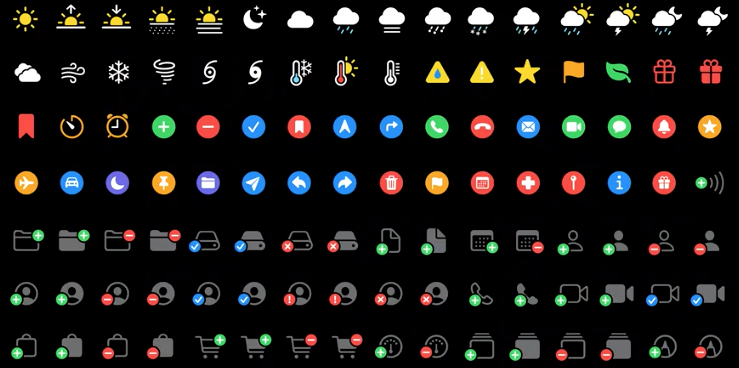
In iOS 14, Apple added over 750 new icons to the SF Symbols library for developers to use in their apps. Additionally, Apple has expanded SF Symbols to include multi-colored icons. For a full overview of the available SF Symbols that are available, including the newly added and multicolor symbols, download the SF Symbols 2 app from Apple's SF Symbols page.

grid of new symbols

To use a multicolored symbol in your app, all you need to do is set the correct rendering mode for your image.

To use a multi-colored icon in SwiftUI you can use the following code:

Image(systemName: "thermometer.sun.fill")
  .font(.largeTitle)
  .renderingMode(.original)

In a UIKit based app, you can set the icon's tint color as follows:

let image = UIImage(systemName: "star.fill")?
  .withRenderingMode(.alwaysOriginal)

Note that at the time of writing I have not managed to get multi-colored SF Symbols to actually work with UIKit and that only a handful of SF Symbols properly show up with multiple colors when used in SwiftUI depending on the device you're using. The iPhone 11 simulator appears to render all icons correctly but the iOS 14 beta on an iPhone 7 doesn't. There's also a bug currently where setting an icon's font-size can cause it to not be colored correctly.

The ability to use multi-colored symbols in your app is a very welcome addition to the SF Symbols feature and I think it can add a really vibrant touch to your apps.

How to change a UICollectionViewListCell’s separator inset

In WWDC2020's session Lists in UICollectionView a slide is shown where a UICollectionViewListCell's separator inset is updated by assigning a new leading anchor to separatorLayoutGuide.leadingAnchor.

Unfortunately, this doesn't work in when you try to do it.

To set the separator inset for a UICollectionViewListCell you can update the leading anchor constraint by overriding updateConstraints in a UICollectionViewListCell subclass. Setting the anchor in init will cause the system to override your custom anchor leaving you with the default inset.

override func updateConstraints() {
  super.updateConstraints()

  separatorLayoutGuide.leadingAnchor.constraint(equalTo: someOtherView.leadingAnchor, constant: 10).isActive = true
}

You can set the leadingAnchor constraint just like you would set any other constraint. In fact, you can even set the separator's trailingAnchor using the same method I just showed if you want to offset the seperator from the trailing edge of your content view.

What’s new with UICollectionView in iOS 14

Last year, the team that works on UICollectionView shipped massive improvements like compositional layout and diffable data sources.

This year, the team went all out and shipped even more amazing improvements to UICollectionView, making UITableView obsolete through the new UICollectionViewCompositionalLayout.list and UICollectionLayoutListConfiguration. This new list layout allows you to create collection views that look and function identical to UITableView. When paired with UICollectionViewListCell your collection view can support features that used to only be available to UITableView.

For instance, you can now add swipe actions to a cell and set its accessories to add certain affordances on a cell like a disclosure indicator.

In addition adding features that make collection views look more like table views when needed, the team also made huge improvements to data sources.

Diffable data sources now have first class support for features like reordering and deleting cells. All you have to do is assign a couple of handlers to your data source and the system handles the rest.

As if that's not enough, you can now build collapsable lists in collection views with hardly any effort at all by setting up your diffable data sources with hierarchical data. This is going to save plenty of folks some serious headaches.

If you've worked with diffable data sources before you probably know that they are super convenient. However, every time you want to change a snapshot for your diffable data source in iOS 13 you must recreate or update the entire snapshot. In iOS 14 you can use section snapshots which allow you to only update a specific section in your data source rather than rebuiding the entire snapshot every time.

Apple also made a whole bunch of changes to how we configure collection view cells. Cells can now adopt a new feature that lets developers apply states and configurations to cells to set up their appearance and state. This means that you no longer directly assign values to labels, images or other components of a cell but instead the cell takes a configuration object and updates its UI accordingly. The best part of this feature in my opinion is that these configurations are not tied to collection view cells per se. Any view that can work with these configurations can accept and apply a configuration making this a highly portably and flexible feature.

Last but not least I would like to mention that in iOS 14 there's a new way for developers to register and dequeue their collection view cells. In iOS 13 and earlier you would use a string identifier to register and dequeue cells. In iOS 14 you can do this through the new UICollectionView.CellRegistration and it's truly awesome.

I'm super happy with all of these new collection view features and I can't wait to take them for a spin.

Learn how to use new UICollectionView features

How to add a custom accessory to a UICollectionViewListCell?

Apple provides several accessory types that you can use to apply certain affordances to a UICollectionViewListCell. However, sometimes these options don't suit your needs and you're looking for something more customizable.

To add a custom accessory to a list cell instead of a standard one, you use the .custom accessory type. The initializer for this accessory takes a UICellAccessory.CustomViewConfiguration that describes how your accessory should look and where it's positioned. Let's dive right in with an example:

// create the accessory configuration
let customAccessory = UICellAccessory.CustomViewConfiguration(
  customView: UIImageView(image: UIImage(systemName: "paperplane")),
  placement: .leading(displayed: .always))

// add the accessory to the cell
cell.accessories = [.customView(configuration: customAccessory)]

To create a custom accessory all you really need to provide is a view that you want to display, and you need to specify where and when the accessory should be displayed. In this case, I created a simple UIImageView that shows a paperplane SF Symbol that's always visible on the leading edge of the cell. It's also possible to pass .trailing to make the accessory appear on the trailing edge of the cell. For the displayed argument of placement, you can pass .whenEditing or .whenNotEditing instead of .always to control whether your accessory should or shouldn't be visible when the collection view is in edit mode.

By default your custom accessory will be shown as close to the content as possible if there are multiple accessories shown on the same side of the cell. You can customize this by passing a closure to the placement object:

let customAccessory = UICellAccessory.CustomViewConfiguration(
  customView: UIImageView(image: UIImage(systemName: "paperplane")),
  placement: .trailing(displayed: .always, at: { accessories in
    return 1
  }))

In the closure you receive the other accessories that are shown on the same side as your accessory and you can return the preferred position for your accessory. A lower value makes your accessory appear closer to the content.

While you can already build a pretty nice accessory with this, there are more arguments that you can pass to UICellAccessory.CustomViewConfiguration's initializer:

let customAccessory = UICellAccessory.CustomViewConfiguration(
  customView: UIImageView(image: UIImage(systemName: "paperplane")),
  placement: .leading(displayed: .always, at: { accessories in
    return 1
  }),
  reservedLayoutWidth: .standard,
  tintColor: .darkGray,
  maintainsFixedSize: false)

This is an example of a fully customized accessory. In addition to the required two arguments you can also pass a reservedLayoutWidth to tell iOS how much space should be used for your accessory. This will help iOS build your layout and space the cell's content appropriately. The tintColor argument is used to set a color for your accessory. The default color is a blue color, in this example I changed this color to .darkGray. Lastly you can determine if the accessory maintains a fixed size, or if it can scale if needed.

How to add accessories to a UICollectionViewListCell?

In iOS 14 Apple added the ability for developers to create collection views that look and feel like table views, except they are far, far more powerful. To do this, Apple introduced a new UICollectionViewCell subclass called UICollectionViewListCell. This new cell class allows us to implement several tableviewcell-like principles, including accessories.

Adding accessories to a cell is done by assigning an array of UICellAccessory items to a UICollectionViewListCell's accessories property. For example, to make a UICollectionViewListCell show a disclosure indicator that makes it clear to a user that they will see more content if they tapp a cell, you would use the following code:

listCell.accessories = [.disclosureIndicator()]

You set a cell's accessories in either the cellForItemAt UICollectionViewDataSource method or in your CellRegistration closure.

Apple has added a whole bunch of accessories that you can add to your cells. For example checkmark to to show the checkmark symbol that you might know from UITableView, .delete to indicate that a user can delete a cell, .reorder to show a reorder control, and more.

You have full control over when certain accessories are displayed and their color. For example, a reorder control is normally only visible when a collection view is in edit mode. To make it always visible, and make it orange instead of gray you'd use the following code:

cell.accessories = [.reorder(displayed: .always, options: .init(tintColor: .orange, showsVerticalSeparator: false))]

Every accessory has its own options object with different parameters. Refer to the documentation to see the configuration options for accessories you're interested in.

How to add custom swipe actions to a UICollectionViewListCell?

In iOS 14 Apple added the ability for developers to create collection views that look and feel like table views, except they are far, far more powerful. To do this, Apple introduced a new UICollectionViewCell subclass called UICollectionViewListCell. This new cell class allows us to implement several tableviewcell-like principles, including swipe actions.

You can add both leading and trailing swipe actions to a cell by assigning a UISwipeActionsConfigurationProvider instance to the collection view's UICollectionLayoutListConfiguration object's leadingSwipeActionsConfigurationProvider and trailingSwipeActionsConfigurationProvider properties. This swipe actions provider is expected to return an instance of UISwipeActionsConfiguration. A UISwipeActionsConfiguration is created using an array of one or more UIContextualAction instances.

You can customize the icon, title, and background color of a contextual icon as needed. Setting an image and background is optional but you are required to pass a title to the UIContextualAction initializer.

Let's look at an example of how you can add a simple trailing swipe action to a list configuration instance:

let listConfig = UICollectionLayoutListConfiguration(appearance: .insetGrouped)

listConfig.trailingSwipeActionsConfigurationProvider = { [weak self] indexPath in 
  guard let self = self else { return nil }

  let model = self.dataSource[indexPath.row] // get the model for the given index path from your data source

  let actionHandler: UIContextualAction.Handler = { action, view, completion in
    model.isDone = true
    completion(true)
    self.collectionView.reloadItems(at: [indexPath])
  }

  let action = UIContextualAction(style: .normal, title: "Done!", handler: actionHandler)
  action.image = UIImage(systemName: "checkmark")
  action.backgroundColor = .systemGreen

  return UISwipeActionsConfiguration(actions: [action])
}

let listLayout = UICollectionViewCompositionalLayout.list(using: listConfig)

collectionView = UICollectionView(frame: .zero, collectionViewLayout: listLayout)

This is a very simple configuration that adds a single trailing action to every cell in the list. The action is configured to have a green background and has a checkmark icon. Note that when you set an image on the action, the tite is hidden from view on iOS. It's still used for accessibillity so make sure to set a good title, even if you plan on using an image in the UI.

Important
Notice that I assign listConfig.trailingSwipeActionsConfigurationProvider before creating my listLayout property. Since UICollectionLayoutListConfiguration is a struct you need to make sure it's fully configured before using it to create a list layout. If you create the list layout first, it will use its own copy of your list configuration and updates you make to your initial instance won't carry over to the UICollectionViewCompositionalLayout because it uses its own copy of the configuration object.

You can return different configurations depending on the index path that you're supplying the swipe actions for. If you don't want to have any swipe actions for a certain index path, you can return nil from the closure that's used to configure your swipe actions.

Note that I created a .normal contextual action. The other option here is .desctructive to indicate that an action might destruct data.

The action handler that's passed to UIContextualAction receives a reference to the action that triggered it, the view that this occured in and a completion handler that you must call.

You also receive a completion handler in the action handler. You must call this handler when you're done handling the action and pass true if you handled the action successfully. If you failed to successfully handle the action, you must pass false. This allows the system to perform any tasks (if needed) related to whether you were able to handle the action or not.

Configure collection view cells with UICollectionView.CellRegistration

In iOS 14 you can use the new UICollectionView.CellRegistration class to register and configure your UICollectionViewCell instances. So no more let cellIdentifier = "MyCell", no more collectionView.dequeueReusableCell(withReuseIdentifier: "MyCell", for: indexPath) and best of all, you no longer need to cast the cell returned by dequeueReusableCell(withReuseIdentifier:for:) to your custom cell class.

Adopting UICollectionView.CellRegistration in your project is surprisingly straightforward. For demo purposes I created the following UICollectionViewCell subclass:

class MyCollectionViewCell: UICollectionViewCell { 
  let label = UILabel()

  required init?(coder: NSCoder) {
    fatalError("nope!")
  }

  override init(frame: CGRect) {
    super.init(frame: frame)

    contentView.addSubview(label)
    label.translatesAutoresizingMaskIntoConstraints = false
    label.topAnchor.constraint(equalTo: contentView.safeAreaLayoutGuide.topAnchor, constant: 8).isActive = true
    label.leadingAnchor.constraint(equalTo: contentView.safeAreaLayoutGuide.leadingAnchor, constant: 8).isActive = true
    label.bottomAnchor.constraint(equalTo: contentView.safeAreaLayoutGuide.bottomAnchor, constant:  -8).isActive = true
    label.trailingAnchor.constraint(equalTo: contentView.safeAreaLayoutGuide.trailingAnchor, constant: -8).isActive = true
  }
}

To register this cell on a collection view using UICollectionView.CellRegistration all you need is an instance of UICollectionView.CellRegistration that's specialized for your cell class and data model. My case I'm going to use a String as my data model since the cell only has a single label. You can use any object you want for your cells. Usually it will be the model that you retrieve in the cellForItemAt delegate method.

// defined as an instance property on my view controller
let simpleConfig = UICollectionView.CellRegistration<MyCollectionViewCell, String> { (cell, indexPath, model) in
  cell.label.text = model

}

Notice that UICollectionView.CellRegistration is generic over two types. The UICollectionViewCell that I want to use, and the model type which is a String in my case. The initializer for UICollectionView.CellRegistration takes a closure that's used to set up the cell. This closure receives a cell, an index path and the model that's used to configure the cell.

In my implementation I simply assign my String model to cell.label.text.

You don't have to register your UICollectionView.CellRegistration on your UICollectionView. Instead, you can use it when you ask your collection view to dequeue a reusable cell in cellForItemAt as follows:

func collectionView(_ collectionView: UICollectionView, cellForItemAt indexPath: IndexPath) -> UICollectionViewCell {

  let model = "Cell \(indexPath.row)"

  return collectionView.dequeueConfiguredReusableCell(using: simpleConfig,
                                                      for: indexPath,
                                                      item: model)
}

When you call dequeueConfiguredReusableCell(using:for:item:) on a UICollectionView, it dequeues a cell that has the correct class and the closure that you passed to your UICollectionView.CellRegistration initializer is called so you can configure your cell.

All you need to do is make sure that you grab the correct model from your data source, pass it to dequeueConfiguredReusableCell(using:for:item:) and return the freshly obtained cell. That's all there is to it! Pretty nifty right? There's no other special setup involved. No secret tricks. Nothing. Just a much nicer way to obtain and configure collection view cells.

What’s the difference between @StateObject and @ObservedObject?

Views in SwiftUI are thrown away and recreated regularly. When this happens, the entire view struct is initialized all over again. Because of this, any values that you create in a SwiftUI view are reset to their default values unless you've marked these values using @State.

This means that if you declare a view that creates its own @ObservedObject instance, that instance is replaced every time SwiftUI decides that it needs to discard and redraw that view.

If you want to see what I mean, try running the following SwiftUI view:

class DataSource: ObservableObject {
  @Published var counter = 0
}

struct Counter: View {
  @ObservedObject var dataSource = DataSource()

  var body: some View {
    VStack {
      Button("Increment counter") {
        dataSource.counter += 1
      }

      Text("Count is \(dataSource.counter)")
    }
  }
}

struct ItemList: View {
  @State private var items = ["hello", "world"]

  var body: some View {
    VStack {
      Button("Append item to list") {
        items.append("test")
      }

      List(items, id: \.self) { name in
        Text(name)
      }

      Counter()
    }
  }
}

While the views in this example might not be super useful, it does a good job of demonstrating how Counter creates its own @ObservedObject. If you'd tap the Increment counter button defined in Counter a couple of times, you'd see that its Count is ... label updates everytime. If you then tap the Append item to list button that's defined in ItemList, the Count is ... label in Counter resets back to 0. The reason for this is that Counter got recreated which means that we now have a fresh instance of DataSource.

To fix this, we could either create the DataSource in ItemList, keep that instance around as a property on ItemList and pass that instance to Counter, or we can use @StateObject instead of @ObservedObject:

struct Counter: View {
  @StateObject var dataSource = DataSource()

  var body: some View {
    VStack {
      Button("Increment counter") {
        dataSource.counter += 1
      }

      Text("Count is \(dataSource.counter)")
    }
  }
}

By making DataSource a @StateObject, the instance we create is kept around and used whenever the Counter view is recreated. This is extremely useful because ItemList doesn't have to retain the DataSource on behalf of the Counter, which makes the DataSource that much cleaner.

You should use @StateObject for any ObservableObject properties that you create yourself in the object that holds on to that object. So in this case, Counter creates its own DataSource which means that if we want to keep it around, we must mark it as an @StateObject.

If a view receives an ObservableObject in its initializer you can use @ObservedObject because the view does not create that instance on its own:

struct Counter: View {
  // the DataSource must now be passed to Counter's initializer
  @ObservedObject var dataSource: DataSource

  var body: some View {
    VStack {
      Button("Increment counter") {
        dataSource.counter += 1
      }

      Text("Count is \(dataSource.counter)")
    }
  }
}

Keep in mind though that this does not solve the problem in all cases. If the object that creates Counter (or your view that has an @ObservedObject) does not retain the ObservableObject, a new instance is created every time that view redraws its body:

struct ItemList: View {
  @State private var items = ["hello", "world"]

  var body: some View {
    VStack {
      Button("Append item to list") {
        items.append("test")
      }

      List(items, id: \.self) { name in
        Text(name)
      }

      // a new data source is created for every redraw
      Counter(dataSource: DataSource())
    }
  }
}

However, this does not mean that you should mark all of your @ObservedObject properties as @StateObject. In this last case, it might be the intent of the ItemList to create a fresh DataSource every time the view is redrawn. If you'd have marked Counter.dataSource as @StateObject the new instance would be ignored and your app might now have a new hidden bug.

A not completely unimportant implication of @StateObject is performance. If you're using an @ObservedObject that's recreated often that might harm your view's rendering performance. Since @StateObject is not recreated for every view re-render, it has a far smaller impact on your view's drawing cycle. Of course, the impact might be minimal for a small object, but could grow rapidly if your @ObservedObject is more complex.

So in short, you should use @StateObject for any observable properties that you initialize in the view that uses it. If the ObservableObject instance is created externally and passed to the view that uses it mark your property with @ObservedObject.

For a quick reference to SwiftUI's property wrappers, take a look at swiftuipropertywrappers.com.

Using custom publishers to drive SwiftUI views

In SwiftUI, views can be driven by an @Published property that's part of an ObservableObject. If you've used SwiftUI and @Published before, following code should look somewhat familiar to you:

class DataSource: ObservableObject {
  @Published var names = [String]()
}

struct NamesList: View {
  @ObservedObject var dataSource: DataSource

  var body: some View {
    List(dataSource.names, id: \.self) { name in
      Text(name)
    }
  }
}

Whenever the DataSource object's names array changes, NamesList will be automatically redrawn. That's great.

Now imagine that our list of names is retrieved through the network somehow and we want to load the list of names in the onAppear for NamesList.

class DataSource: ObservableObject {
  @Published var names = [String]()

  let networkingObject = NetworkingObject()
  var cancellables = Set<AnyCancellable>()

  func loadNames() {
    networkingObject.loadNames()
      .receive(on: DispatchQueue.main)
      .sink(receiveValue: { [weak self] names in
        self?.names = names
      })
      .store(in: &cancellables)
  }
}

struct NamesList: View {
  @ObservedObject var dataSource: DataSource

  var body: some View {
    List(dataSource.names, id: \.self) { name in
      Text(name)
    }.onAppear(perform: {
      dataSource.loadNames()
    })
  }
}

This would work and it's the way to go on iOS 13 but I've never liked having to subscribe to a publisher just so I could update an @Published property. Luckily, in iOS 14 we can refactor loadNames() and do much better with the new assign(to:) operator:

class DataSource: ObservableObject {
  @Published var names = [String]()

  let networkingObject = NetworkingObject()

  func loadNames() {
    networkingObject.loadNames()
      .receive(on: DispatchQueue.main)
      .assign(to: &$names)
  }
}

The assign(to:) operator allows you to assign the output from a publisher directly to an @Published property under one condition. The publisher that you apply the assign(to:) on must have Never as its error type. Note that I had to add an & prefix to $names. The reason for this is that assign(to:) receives its target @Published property as an inout parameter, and inout parameters in Swift are always passed with an & prefix. To learn more about replacing errors so your publisher can have Never as its error type, refer to this blog post I wrote about catch and replaceError in Combine.

Pretty cool, right?

Ignore first number of elements from a publisher in Combine

If you have a Combine publisher and you want to ignore the first n elements that are published by that publisher, you can use the dropFirst(_:) operator. This operator will swallow any values emitted until the threshold you specify is reached. For example, dropFirst(1) will ignore the first emitted value from a publisher:

[1, 2, 3].publisher
  .dropFirst(1)
  .sink(receiveValue: { value in 
    print(value) // 2 and 3 are printed
  })

For more information about dropFirst and several variations of drop like drop(while:) and drop(untilOutputFrom:) you can refer to Apple's documentation.